Could you be happier at work?
Take our quiz and find out! It takes just five minutes and you'll get a data-packed report afterwards.
COVID-19 and The Curve of Resilience
Friday Pulse was never designed to pick up global trends — it’s a tool for building positive experiences across the microcultures of an organization. It emphasizes the team experience because we know from our data that there are as many microcultures in an organization as there are teams. It’s the blending of all these subcultures that creates the work experience.
The core feature of Friday Pulse is to gather data on how people are feeling at work. This data isn’t just used to observe how employees are faring, it’s used to inform and influence how everyone works together. The base scores of employees’ experience of work provide immediate visibility to senior leaders into how every team is coping and, each week, it provides actionable insights for team leaders.
There’s a growing body of proof on why a positive culture is crucial to the success of a business. But that’s something we’ve known about for a while — happy people do better work. They’re healthier, and less likely to leave. They’re more creative and productive. These are things that ultimately impact the bottom line.
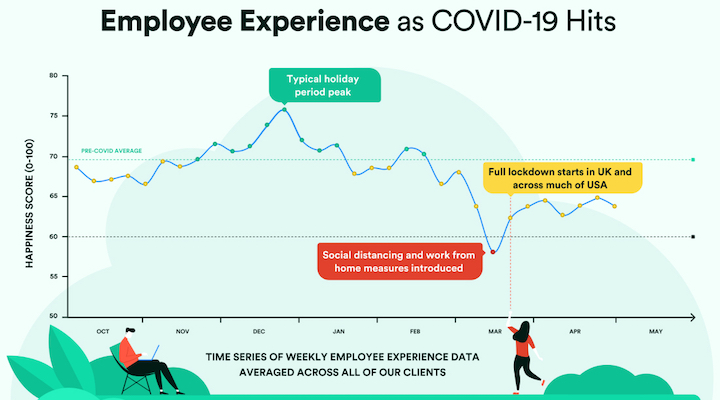
Global trends found in every company But when COVID-19 struck, our platform found a trend across all of our clients, in every industry, at the same time. The graph below shows the impact of the virus on employee experience.

There’s a bit of common sense to this — of course, COVID-19 would result in a drop in happiness scores. However, the shape of this curve is something with which we are very familiar — it’s a curve that happens at both team and organizational level when setbacks occur. And now this curve, which we had only seen on a case-by-case basis, can be found across all organizations.
Since then, there has been a partial bounce back but there is still a significant gap between the levels now and the pre-pandemic average (69.6 on our 100-point scale). The road to recovery is bumpy and there are potentials for second (and third) dips. But, even these dips in team morale can have an impact on productivity, collaboration and innovation.
The stories within the curve
What’s important to note about this curve is that these are our clients — organizations that are already monitoring experience weekly, as they value their employees’ wellbeing and understand that high morale builds better businesses. And, crucially, they actively act on their data. Therefore, it’s quite probable that the resilience and rebound that the curve displays is stronger in our clients than in the majority of businesses globally.

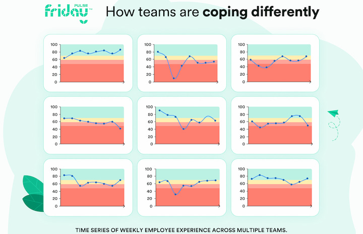
The curve tells a story, or more accurately, it summarizes thousands of stories. It shows how we collectively suffered a massive shock to the system – at the same time. It shows people, teams and organizations coping (or not) with the difficult and challenging circumstances. The graphic below is a glimpse into the multitude of different team experiences over the last two months.
It reveals much of what you already know — some people with emotional and financial stability in their home lives are coping well. Others, perhaps with young children in their households, have multiple stresses. The circumstances that surround each individual team member varies from person to person, team to team. It is dangerous to assume that when all is quiet, all is well as some may be suffering in silence.
Ultimately this means that responses have to be nuanced and particular as well. Because of the broad range of experiences and subcultures that exist in an organization, a blanket response will likely be unsuccessful. Businesses can and should use wellbeing data to navigate their way through this global crisis and build resilience for the future.
The bounce back
We can’t draw any final conclusions with the data because we don’t yet know how the story ends. But, we do know this: humans are resilient. We want to bounce back. The curve over time shows the resilience of the human spirit. Some of our clients have bounced back and are doing well. However, that didn’t come with wishful thinking — they have worked hard at it, tracked their team data and took appropriate actions to help their people.